|
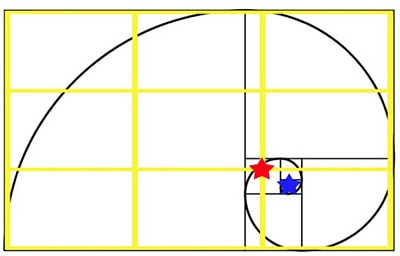
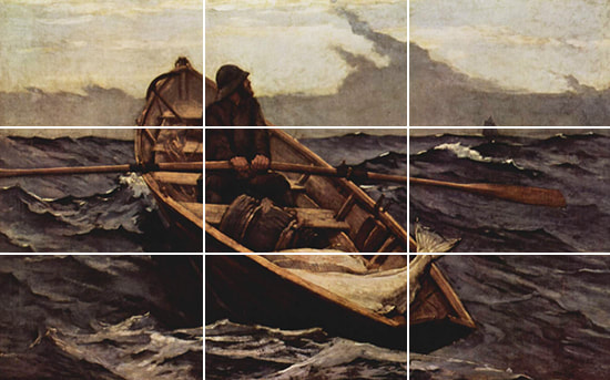
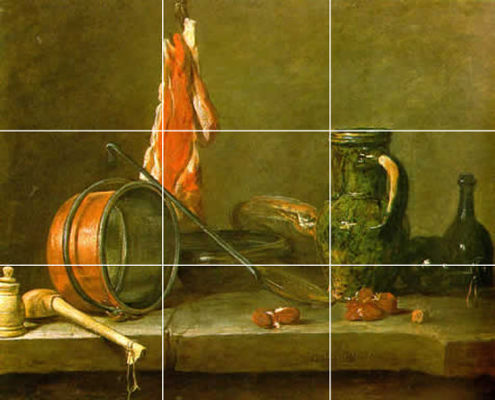
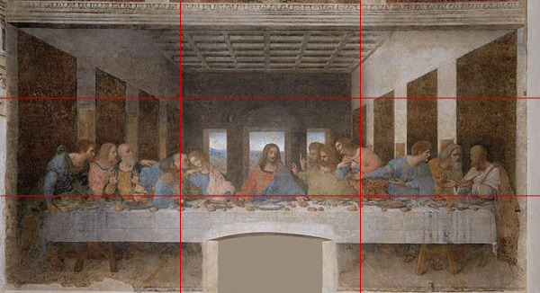
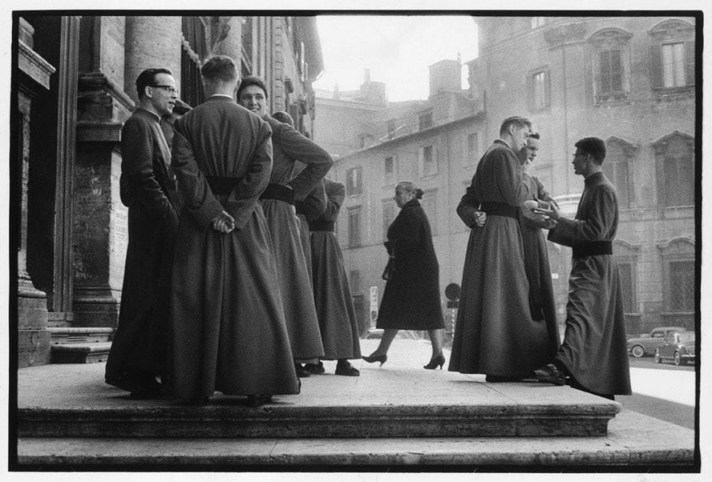
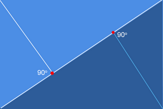
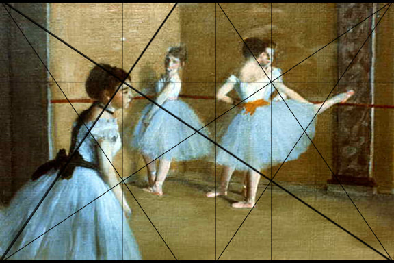
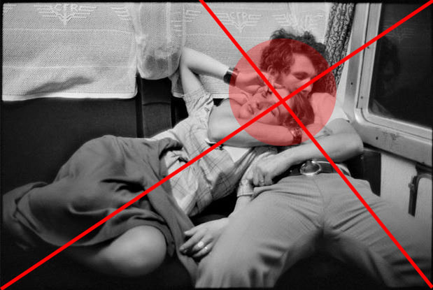
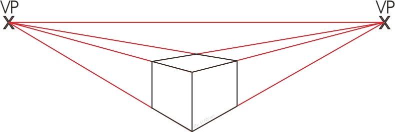
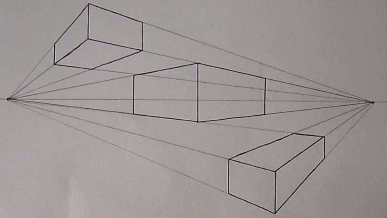
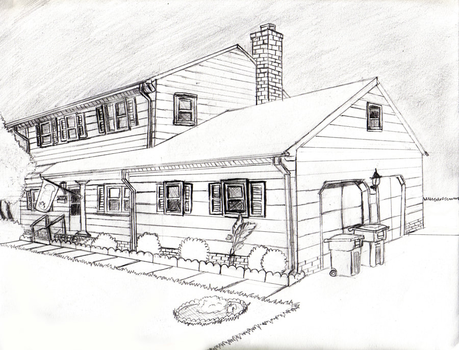
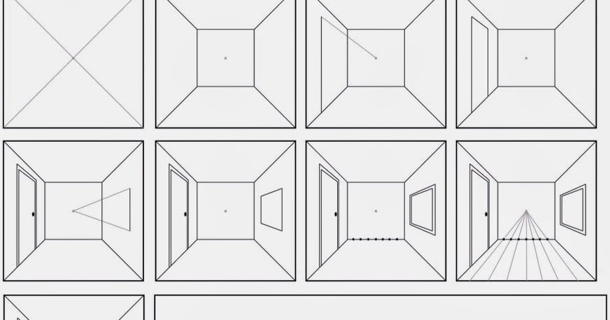
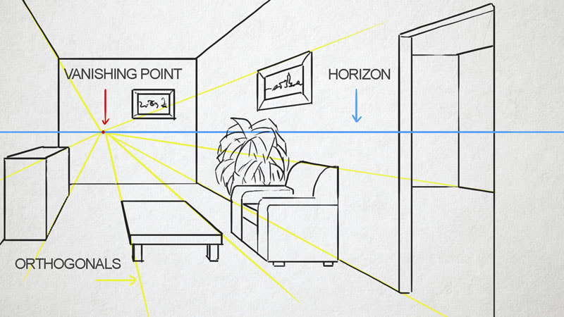
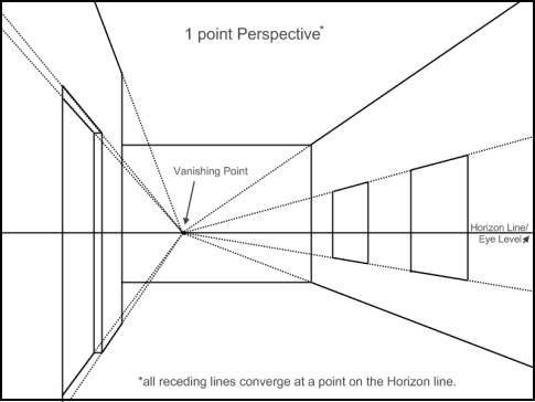
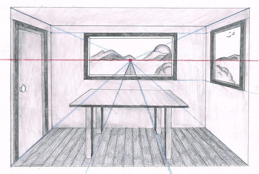
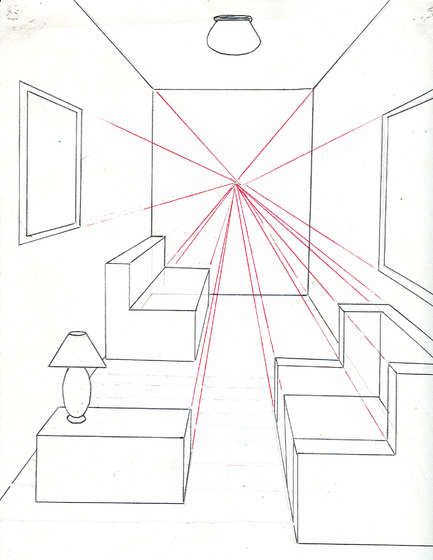
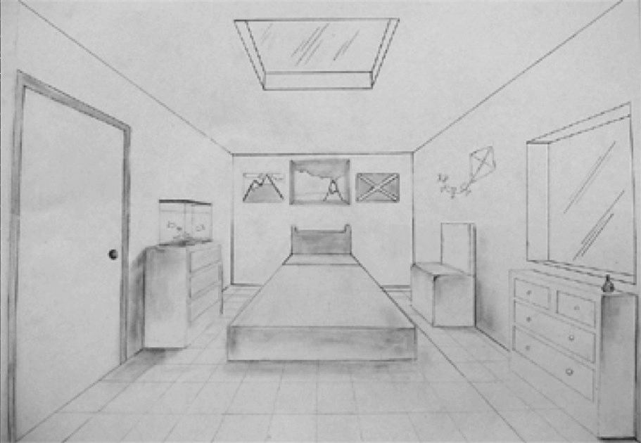
Balance: A principle of design referring to the arrangement of visual elements to create stability in an artwork. Symmetrical Balance: A balance arrangement in which the parts of a composition are organized so that one side duplicates or mirrors the other. Approximate (Modified) Symmetry: The use of forms that are similar yet different, on either side of a vertical axis. Asymmetrical Balance: A feeling of balance attained when visual units on either side of a vertical axis are actually different but are placed in the composition to create a "felt" balance of the total artwork. We will be looking at three different types of asymmetrical balance: Golden Ratio, Rule of Thirds, and "Golden Triangle." Space: An element of art that indicates areas between, around, above, below, or within something. Symmetrical and Radial Balance: video Asymmetrical Balance Golden Ratio: DD in MML -- watch from 7 to 10:30. From Golden Ratio to Rule of Thirds: Rule of Odds: is really a guideline about symmetry. It is more pleasant to look at an emphasized object that is framed by an even number of surrounding objects. The effect is diminished (and eventually disappears) as the number of objects increases. Triangles in Composition: If we follow the Rule of Odds, and use the smallest odd number larger than one; we have three objects of interest in our composition. Those three objects can be connected -- like points -- to form a triangle. But it doesn't stop there. Implied triangles can be seen in portraits where a triangle is formed by imagining the base of the triangle at the shoulders, and the point of the triangle at the top of the head. Here are some examples. The "Golden Triangle:" In art, the "golden triangle" describes a way that a diagonal line can be used to create an interesting composition. The "golden triangle" is created by placing a diagonal line from one corner of a picture plane to another; then another line connects the diagonal line to a third corner at a ninety degree angle.   Picture plane: the flat surface or plane in which the artist organizes the picture. Scale (related to proportion): a technique where the artist makes one object larger than another in order to cause the larger object to appear closer to us than the smaller object. Overlapping: a technique where the artist creates the illusion of depth by placing one object in front of another. High-low placement: a technique where the artist places an object lower in the picture plane to make it appear closer to us than another object that is placed higher. Arial perspective: a technique where the artist reduces the detail, and color intensity, as well as shifts the hue of an object toward the blueish end of the visible light spectrum in order to give the illusion of distance. Linear perspective: A technique of creating the illusion of depth on a flat surface. All parallel lines receding into the distance are drawn to converge at one or more vanishing points on the eye-level line. Vanishing point: A point on the eye-level line, toward which parallel lines are made to recede and meet in perspective drawing. Eye level: A horizontally drawn line that is even with the viewer’s eye. In landscape scenes it can be the actual horizon line, but it can also be drawn in still life. Convergence: In linear perspective, lines that represent parallel edges of an object; these may be drawn to converge to a single vanishing point. Foreshortening: A method of applying perspective to an object or figure so that it seems to recede in space by shortening the depth dimension, making the object or figure appear three-dimensional. 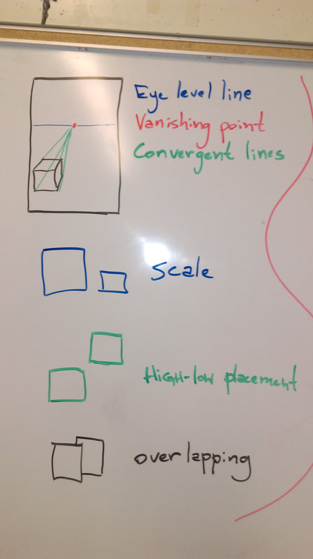 Tetradic Color SchemeColor Scheme Project
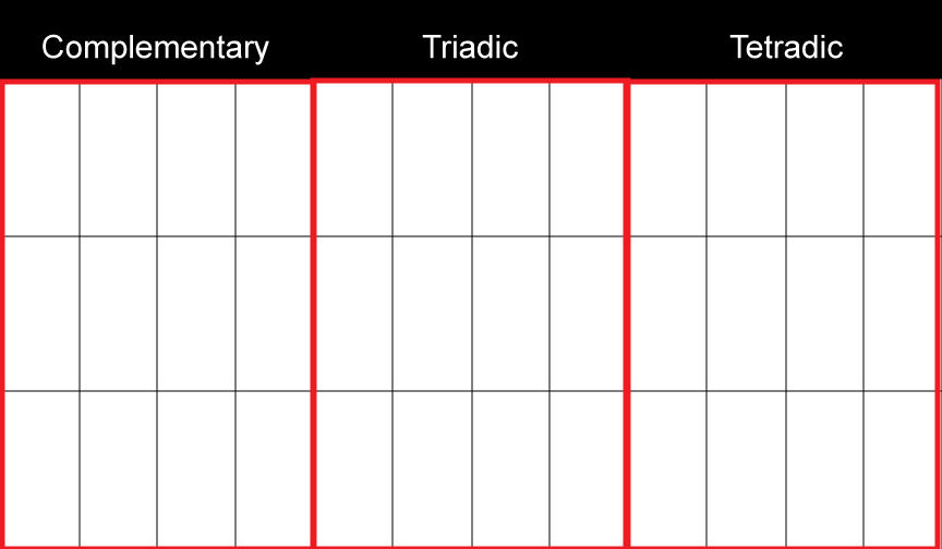
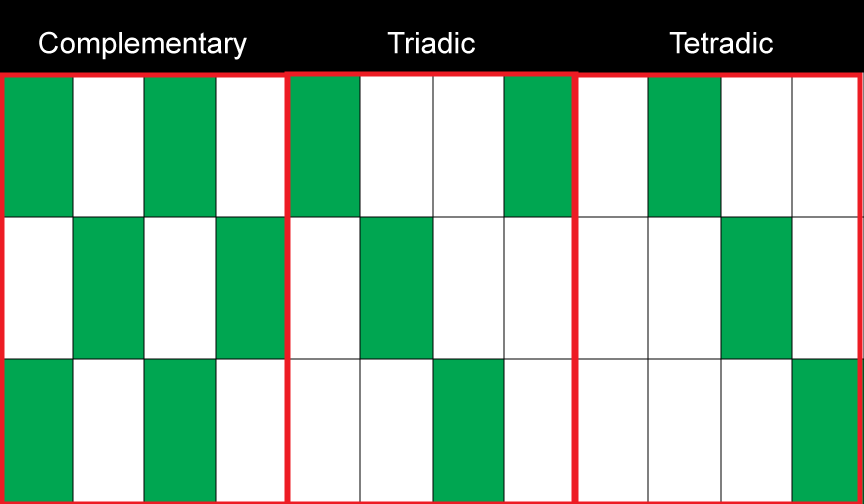
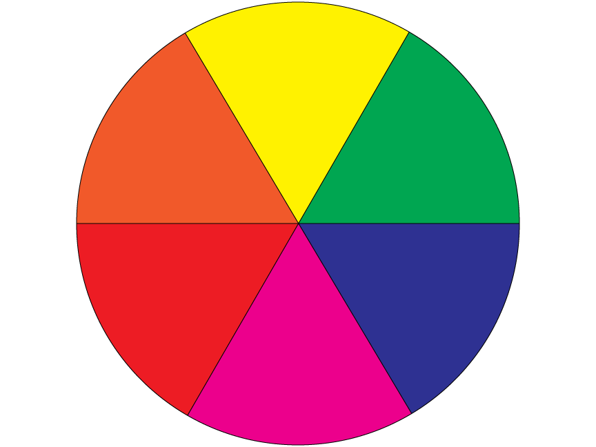
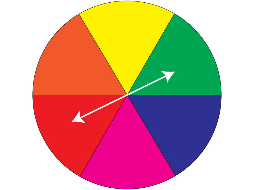
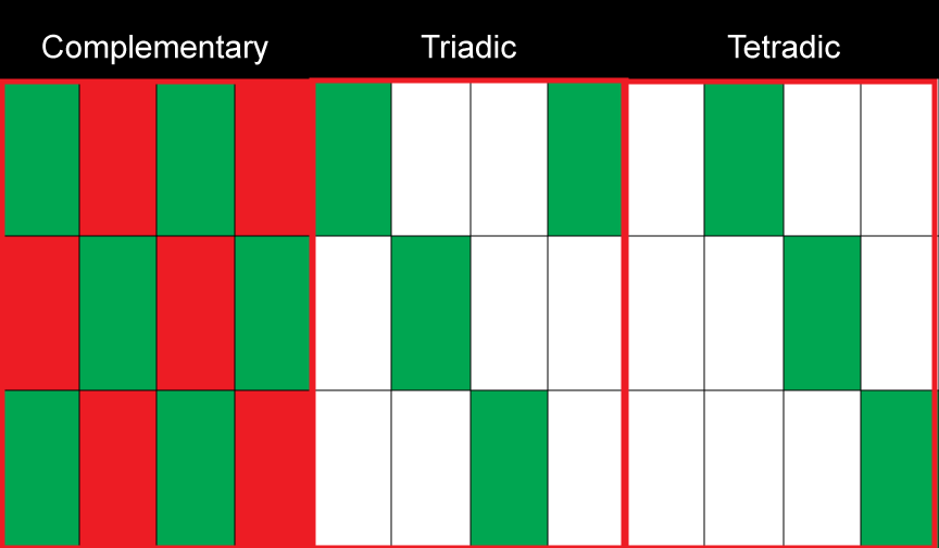
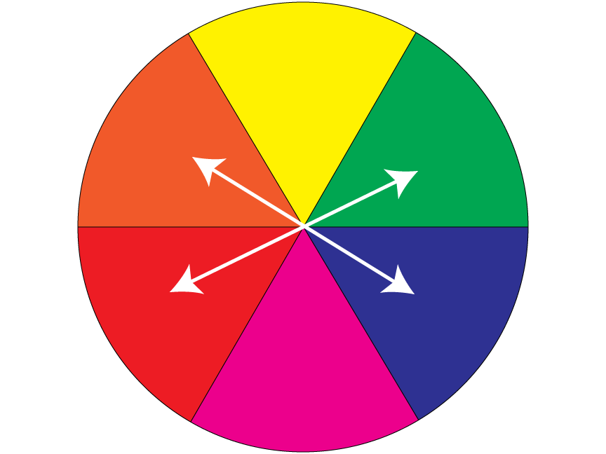
Color SchemesAnalogous Color Scheme: groups of colors that are adjacent to each other on the color wheel. Complementary Color Scheme: colors that are opposite each other on the color wheel. Split-Complementary Color Scheme: a variation of the complementary color scheme which uses the two analogous colors adjacent to a color whose complement is the third color of this color scheme (Split-Complementary Color Scheme Examples). Triadic Color Scheme: three colors equally spaced around the color wheel. Tetradic Color Scheme: uses four colors arranged into two complementary color pairs. 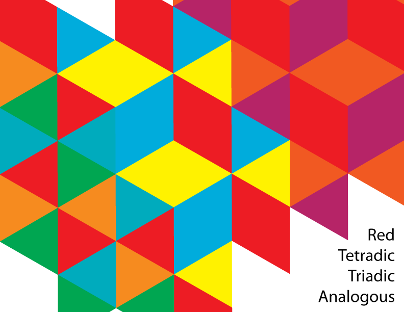 In the example above, red is the consistent color. In the tetradic example; red, orange, green, and blue are used. In the triadic example; red, yellow, and red are used. In the analogous example; red, orange, and purple were used. Another Color Scheme Project Example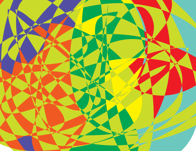 Split-Complementary Color Scheme:Triadic Color Scheme: |
Archives
September 2019
Categories |


 RSS Feed
