|
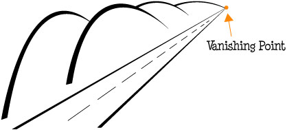
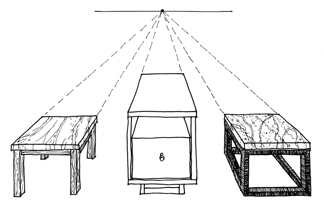
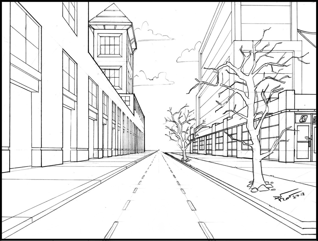
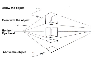
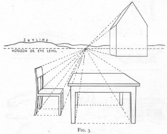
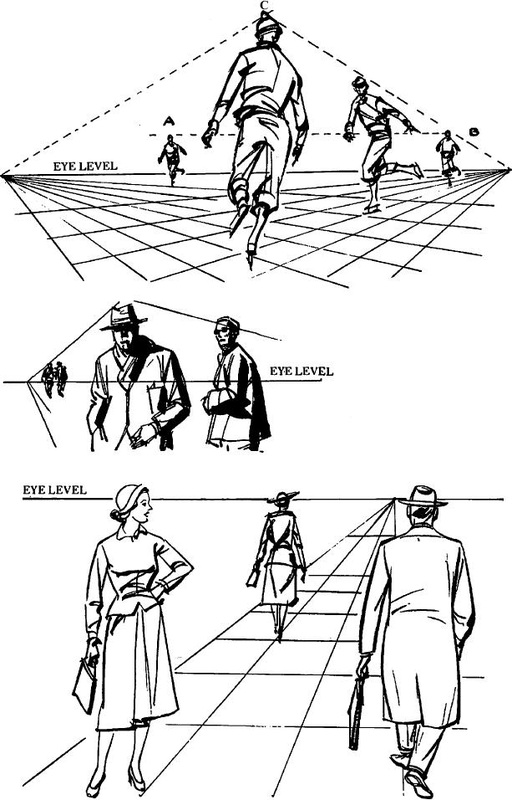
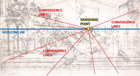
Project 10 Due on Friday, July 3rd, 2016 Officially the penultimate project Step 1: Choose a tutorial -- either One Point Exterior Perspective or 1 Point Perspective Interior, Step 2: Add details from images you find online to create your composite image. What is a composite image? A composite Image is a picture that is made from the combination of multiple images merged into a single surface. Example: Create a Fantasy City Using Architectural Photographs What do I do if the perspectives of my source images do not match the perspective of my final image? 1) Correct for lens distortion Photoshop Help: Use the Adaptive Wide Angle filter Video: Adaptive Wide Angle 2) Match the perspective Photoshop Help: Transform objects Video: Fit Objects Into Perspective Step 3 will involve correcting for tone, adding shadows, and atmospheric perspective. We will discuss Step 3 next Wednesday :) Step 3: Make it all look as if it belongs together. • Match the tone (color) throughout the image Photoshop Help: Match, replace, and mix colors Video: Photoshop Color Matching: The Fastest Method • Add shadows wherever necessary Photoshop Help: Layer effects and styles Video: Two Minute Tip: Creating a Realistic Drop-Shadow in Photoshop The Final Project Due for critiquing on Friday, June 3rd, 2016 Create BOTH (one of each): You can use whatever program you are comfortable using; Photoshop, Illustrator, Flash, or Whatever (if you want, you can draw or paint your design). Both designs must have a thee-hundred dots per inch (300 Pixels/Inch) resolution. Both designs must be in CMYK color mode. A Spirit Day T-shirt design for next year. The design should be roughly ten inches wide by twelve inches high (10" X 12"). The design should use between two and four colors; with no gradients, color blends, feathering, drop shadows, inner glows, et cetera. The design should include some variation of the text "EWMS," "Seahawks," and "2016 - 2017." Keep in mind that the design will be printed on both blue and grey t-shirts, and should look aesthetically pleasing against those colors (perhaps you can, somehow, use those background colors to enhance your design). An Agenda Cover design for next year. The planner is seven inches wide by nine inches high (7" X 9"), but the important elements (safe zone) of the design should fit in an area that is five and three-fifths of an inch wide by eight and one quarter of an inch high (5.6" X 8.25"). There should be a three-eighths inch margin between the edge of the planner and the safe zone on the top, bottom, and right side of your design; and a one and two-fifths inch margin on the left side. The design should use between two colors; with no gradients, color blends, feathering, drop shadows, inner glows, et cetera. The design should include some variation of the text "EWMS," and "2016 - 2017." Keep in mind that the design will be printed on a white background, and should look aesthetically pleasing against a white background (perhaps you can, somehow, use that background color to enhance your design). Here is a template, if you need one :) The Illusion of Depth: Linear Perspective Linear perspective: A technique of creating the illusion of depth on a flat surface. All parallel lines receding into the distance are drawn to converge at one or more vanishing points on the eye-level line. Vanishing point: A point on the eye-level line, toward which parallel lines are made to recede and meet in perspective drawing. Eye level: A horizontally drawn line that is even with the viewer’s eye. In landscape scenes it can be the actual horizon line, but it can also be drawn in still life. Convergence: In linear perspective, lines that represent parallel edges of an object; these may be drawn to converge to a single vanishing point. Foreshortening: A method of applying perspective to an object or figure so that it seems to recede in space by shortening the depth dimension, making the object or figure appear three-dimensional. Linear Perspective Vanishing Point Eye Level Convergence (Orthoganal) Lines Project 10
Officially the penultimate project Step 1: Choose a tutorial -- either One Point Exterior Perspective or 1 Point Perspective Interior, Step 2: Add details from images you find online to create your composite image. What is a composite image? A composite Image is a picture that is made from the combination of multiple images merged into a single surface. Example: Create a Fantasy City Using Architectural Photographs What do I do if the perspectives of my source images do not match the perspective of my final image? 1) Correct for lens distortion Photoshop Help: Use the Adaptive Wide Angle filter Video: Adaptive Wide Angle 2) Match the perspective Photoshop Help: Transform objects Video: Fit Objects Into Perspective Step 3 will involve correcting for tone, adding shadows, and atmospheric perspective. We will discuss Step 3 next Wednesday :) Step 3: Make it all look as if it belongs together. • Match the tone (color) throughout the image Photoshop Help: Match, replace, and mix colors Video: Photoshop Color Matching: The Fastest Method • Add shadows wherever necessary Photoshop Help: Layer effects and styles Video: Two Minute Tip: Creating a Realistic Drop-Shadow in Photoshop The Final Project Due for critiquing on Friday, June 3rd, 2016 Create BOTH (one of each): You can use whatever program you are comfortable using; Photoshop, Illustrator, Flash, or Whatever (if you want, you can draw or paint your design). Both designs must have a thee-hundred dots per inch (300 Pixels/Inch) resolution. Both designs must be in CMYK color mode. A Spirit Day T-shirt design for next year. The design should be roughly ten inches wide by twelve inches high (10" X 12"). The design should use between two and four colors; with no gradients, color blends, feathering, drop shadows, inner glows, et cetera. The design should include some variation of the text "EWMS," "Seahawks," and "2016 - 2017." Keep in mind that the design will be printed on both blue and grey t-shirts, and should look aesthetically pleasing against those colors (perhaps you can, somehow, use those background colors to enhance your design). An Agenda Cover design for next year. The planner is seven inches wide by nine inches high (7" X 9"), but the important elements (safe zone) of the design should fit in an area that is five and three-fifths of an inch wide by eight and one quarter of an inch high (5.6" X 8.25"). There should be a three-eighths inch margin between the edge of the planner and the safe zone on the top, bottom, and right side of your design; and a one and two-fifths inch margin on the left side. The design should use between two colors; with no gradients, color blends, feathering, drop shadows, inner glows, et cetera. The design should include some variation of the text "EWMS," and "2016 - 2017." Keep in mind that the design will be printed on a white background, and should look aesthetically pleasing against a white background (perhaps you can, somehow, use that background color to enhance your design). Here is a template, if you need one :) The Illusion of Depth: Linear Perspective Linear perspective: A technique of creating the illusion of depth on a flat surface. All parallel lines receding into the distance are drawn to converge at one or more vanishing points on the eye-level line. Vanishing point: A point on the eye-level line, toward which parallel lines are made to recede and meet in perspective drawing. Eye level: A horizontally drawn line that is even with the viewer’s eye. In landscape scenes it can be the actual horizon line, but it can also be drawn in still life. Convergence: In linear perspective, lines that represent parallel edges of an object; these may be drawn to converge to a single vanishing point. Foreshortening: A method of applying perspective to an object or figure so that it seems to recede in space by shortening the depth dimension, making the object or figure appear three-dimensional. Video: Linear Perspective: Brunelleschi's Experiement Contemporary Art (from 1945 through the present):
Group 1: Abstract Expressionism (from the 1940s through the present) Group 2: Pop Art (from the 1950s through the present) Group 3: Minimalism (from the 1960s through the present) Group 4: Op Art (from 1964 through the present) Group 5: Photorealism (from the late 1960s through the present) Group 6: Street Art (from the 1980s through the present) Group 7 (Sixth period only): Environmental Art (from the 1970s through the present) Prompts for Group Presentations Trends and Styles of Art: Describe the trends and styles of art from the traditional culture or period in art history. Role and Purpose of Art: What is the role and purpose of art in the traditional culture or period in art history? Arts and Culture or Period: How does art from the traditional culture or period in art history reflect that traditional culture, or period in art history (how does the art reflect the culture or historical period)? Compare and Contrast Art: Compare and contrast art from the traditional culture or period in art history with your understanding of current trends in art (use the previous prompts to direct your comparison). Specific Art: Focus on a specific piece of art from the traditional culture or period in art history. How has the meaning of that piece of art been affected over time because of changes in interpretation and context (How was the art thought of then versus how is the art thought of now)? Specific Artist (second semester): Focus on the work of one artist from the period in art history. What effect did the media (material) used by that artist have on his or her style? How did that artist’s style contribute to the meaning of his or her work? Remember: This is an art presentation; be sure to include relevant art. Do not include unrelated information or images in your presentation. Quiz 15
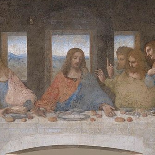
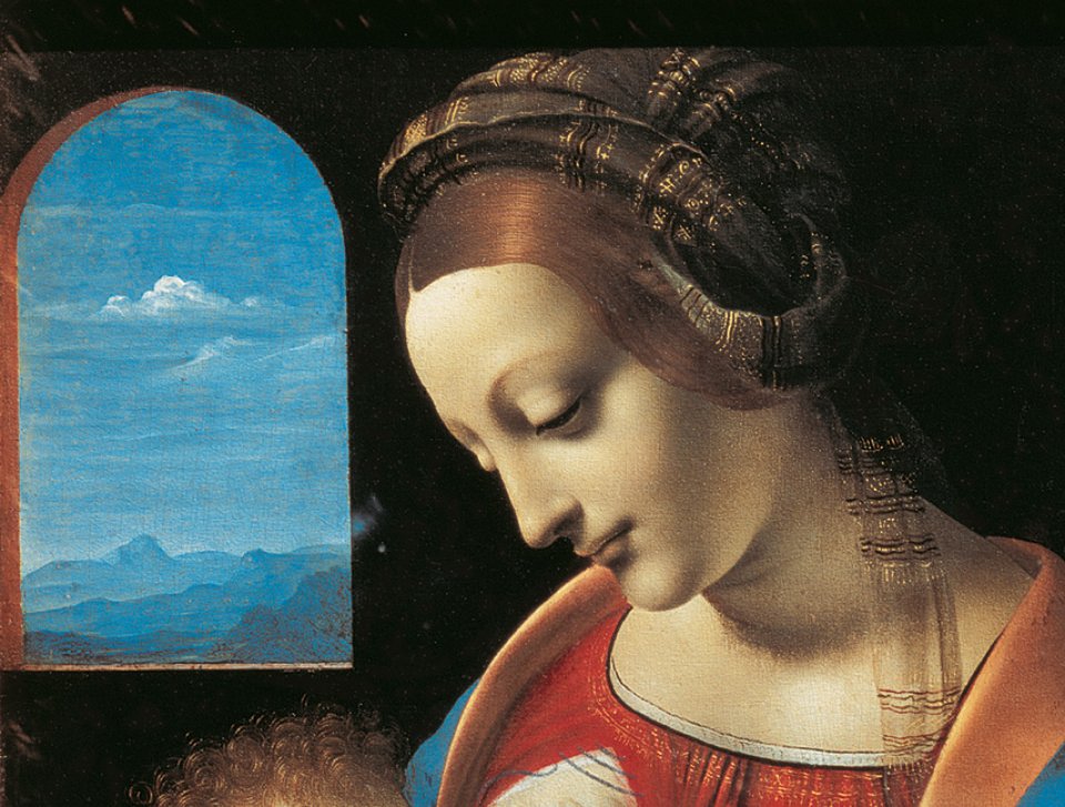
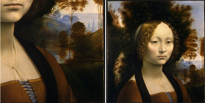
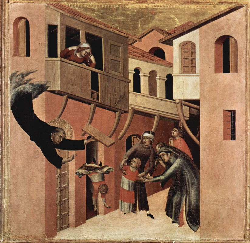
Project 10 Officially the penultimate project Step 1: Choose a tutorial -- either One Point Exterior Perspective or 1 Point Perspective Interior, Step 2: Add details from images you find online to create your composite image. What is a composite image? A composite Image is a picture that is made from the combination of multiple images merged into a single surface. Example: Create a Fantasy City Using Architectural Photographs What do I do if the perspectives of my source images do not match the perspective of my final image? 1) Correct for lens distortion Photoshop Help: Use the Adaptive Wide Angle filter Video: Adaptive Wide Angle 2) Match the perspective Photoshop Help: Transform objects Video: Fit Objects Into Perspective Step 3 will involve correcting for tone, adding shadows, and atmospheric perspective. We will discuss Step 3 next Wednesday :) Step 3: Make it all look as if it belongs together. • Match the tone (color) throughout the image Photoshop Help: Match, replace, and mix colors Video: Photoshop Color Matching: The Fastest Method • Add shadows wherever necessary Photoshop Help: Layer effects and styles Video: Two Minute Tip: Creating a Realistic Drop-Shadow in Photoshop The Final Project Due for critiquing on Friday, June 3rd, 2016 Create BOTH (one of each): You can use whatever program you are comfortable using; Photoshop, Illustrator, Flash, or Whatever (if you want, you can draw or paint your design). Both designs must have a thee-hundred dots per inch (300 Pixels/Inch) resolution. Both designs must be in CMYK color mode. A Spirit Day T-shirt design for next year. The design should be roughly ten inches wide by twelve inches high (10" X 12"). The design should use between two and four colors; with no gradients, color blends, feathering, drop shadows, inner glows, et cetera. The design should include some variation of the text "EWMS," "Seahawks," and "2016 - 2017." Keep in mind that the design will be printed on both blue and grey t-shirts, and should look aesthetically pleasing against those colors (perhaps you can, somehow, use those background colors to enhance your design). An Agenda Cover design for next year. The planner is seven inches wide by nine inches high (7" X 9"), but the important elements (safe zone) of the design should fit in an area that is five and three-fifths of an inch wide by eight and one quarter of an inch high (5.6" X 8.25"). There should be a three-eighths inch margin between the edge of the planner and the safe zone on the top, bottom, and right side of your design; and a one and two-fifths inch margin on the left side. The design should use between two colors; with no gradients, color blends, feathering, drop shadows, inner glows, et cetera. The design should include some variation of the text "EWMS," and "2016 - 2017." Keep in mind that the design will be printed on a white background, and should look aesthetically pleasing against a white background (perhaps you can, somehow, use that background color to enhance your design). Here is a template, if you need one :) How To Screen Print -Step by Step process Project 10 Officially the penultimate project Step 1: Choose a tutorial -- either One Point Exterior Perspective or 1 Point Perspective Interior, Step 2: Add details from images you find online to create your composite image. What is a composite image? A composite Image is a picture that is made from the combination of multiple images merged into a single surface. Example: Create a Fantasy City Using Architectural Photographs What do I do if the perspectives of my source images do not match the perspective of my final image? 1) Correct for lens distortion Photoshop Help: Use the Adaptive Wide Angle filter Video: Adaptive Wide Angle 2) Match the perspective Photoshop Help: Transform objects Video: Fit Objects Into Perspective Step 3 will involve correcting for tone, adding shadows, and atmospheric perspective. We will discuss Step 3 next Wednesday :) Step 3: Make it all look as if it belongs together. • Match the tone (color) throughout the image Photoshop Help: Match, replace, and mix colors Video: Photoshop Color Matching: The Fastest Method • Add shadows wherever necessary Photoshop Help: Layer effects and styles Video: Two Minute Tip: Creating a Realistic Drop-Shadow in Photoshop Vocabulary The quiz will be given on Friday, May 20th, 2016 Picture plane: the flat surface or plane in which the artist organizes the picture. Scale (related to proportion): a technique where the artist makes one object larger than another in order to cause the larger object to appear closer to us than the smaller object. Overlapping: a technique where the artist creates the illusion of depth by placing one object in front of another. High-low placement: a technique where the artist places an object lower in the picture plane to make it appear closer to us than another object that is placed higher. Arial perspective: a technique where the artist reduces the detail, and color intensity, as well as shifts the hue of an object toward the blueish end of the visible light spectrum in order to give the illusion of distance. Illusion of Depth: One of the Things da Vinci Observed Contemporary Art (from 1945 through the present):
Group 1: Abstract Expressionism (from the 1940s through the present) Group 2: Pop Art (from the 1950s through the present) Group 3: Minimalism (from the 1960s through the present) Group 4: Op Art (from 1964 through the present) Group 5: Photorealism (from the late 1960s through the present) Group 6: Street Art (from the 1980s through the present) Group 7 (Sixth period only): Environmental Art (1970s through the present) Prompts for Group Presentations Trends and Styles of Art: Describe the trends and styles of art from the traditional culture or period in art history. Role and Purpose of Art: What is the role and purpose of art in the traditional culture or period in art history? Arts and Culture or Period: How does art from the traditional culture or period in art history reflect that traditional culture, or period in art history (how does the art reflect the culture or historical period)? Compare and Contrast Art: Compare and contrast art from the traditional culture or period in art history with your understanding of current trends in art (use the previous prompts to direct your comparison). Specific Art: Focus on a specific piece of art from the traditional culture or period in art history. How has the meaning of that piece of art been affected over time because of changes in interpretation and context (How was the art thought of then versus how is the art thought of now)? Specific Artist (second semester): Focus on the work of one artist from the period in art history. What effect did the media (material) used by that artist have on his or her style? How did that artist’s style contribute to the meaning of his or her work? Remember: This is an art presentation; be sure to include relevant art. Do not include unrelated information or images in your presentation. Project 10
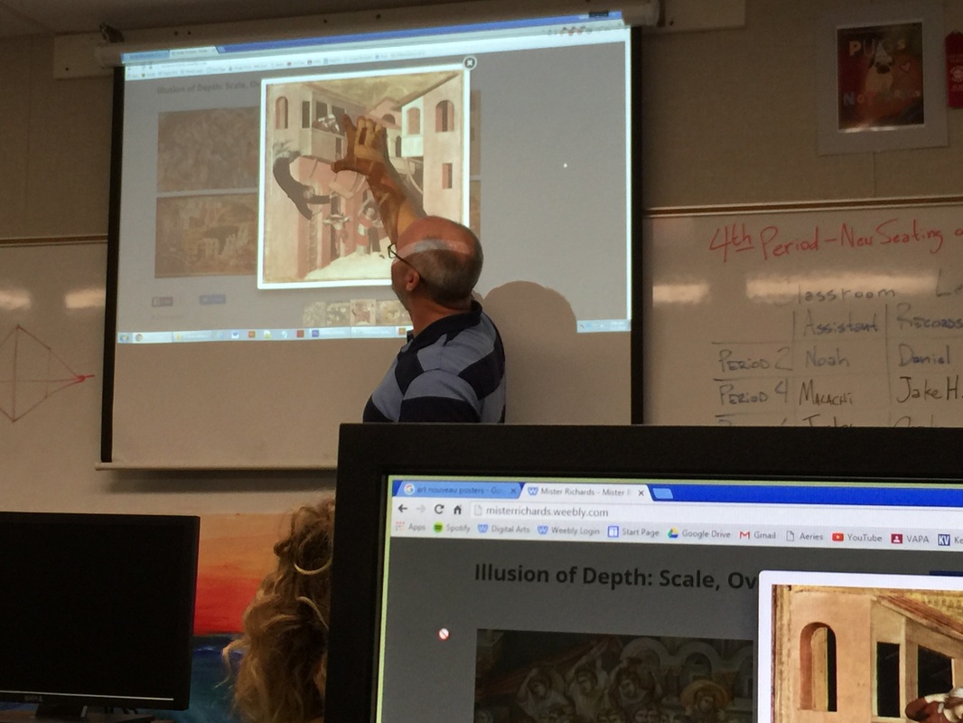
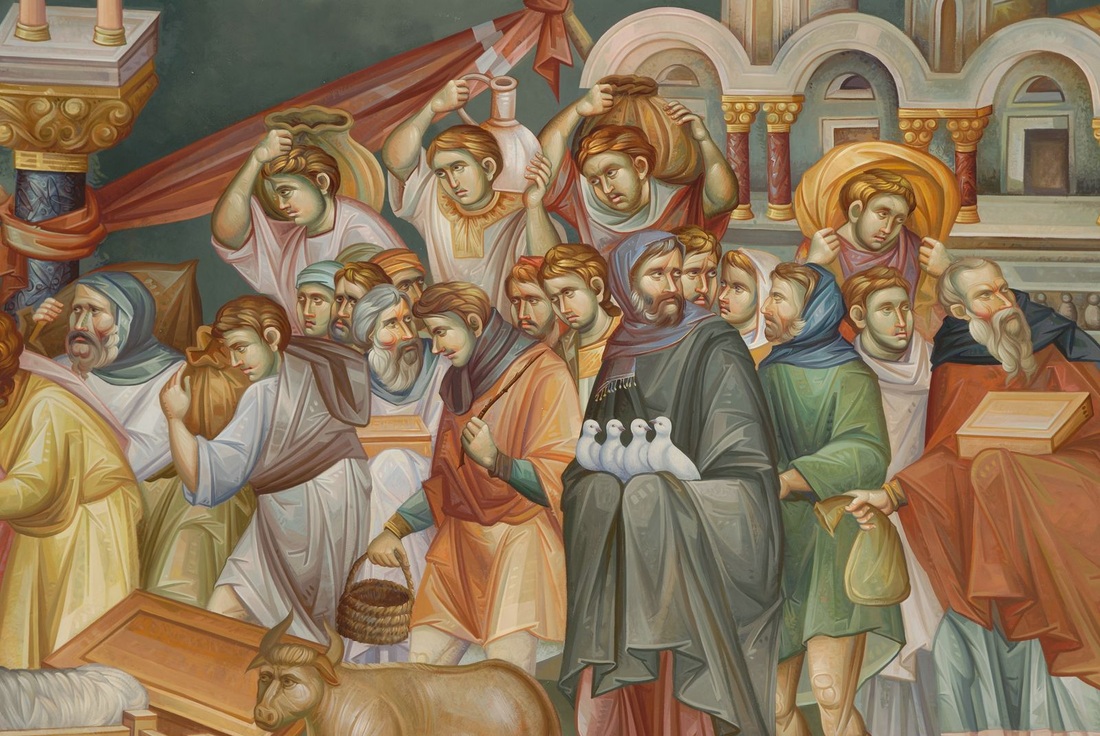
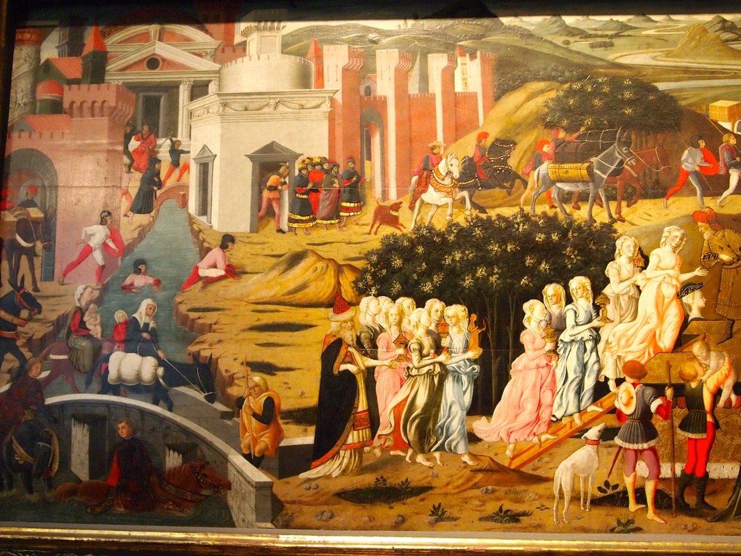
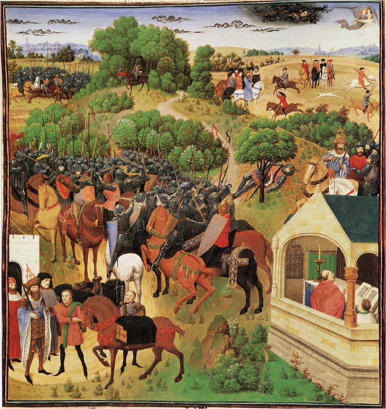
Officially the penultimate project Step 1: Choose a tutorial -- either One Point Exterior Perspective or 1 Point Perspective Interior, Step 2: Add details from images you find online to create your composite image. What is a composite image? A composite Image is a picture that is made from the combination of multiple images merged into a single surface. Example: Create a Fantasy City Using Architectural Photographs What do I do if the perspectives of my source images do not match the perspective of my final image? 1) Correct for lens distortion Photoshop Help: Use the Adaptive Wide Angle filter Video: Adaptive Wide Angle 2) Match the perspective Photoshop Help: Transform objects Video: Fit Objects Into Perspective Step 3 will involve correcting for tone, adding shadows, and atmospheric perspective. We will discuss Step 3 next Wednesday :) Illusion of Depth: Aerial Perspective Video: Atmospheric Perspective Vocabulary The quiz will be given on Friday, May 20th, 2016 Picture plane: the flat surface or plane in which the artist organizes the picture. Scale (related to proportion): a technique where the artist makes one object larger than another in order to cause the larger object to appear closer to us than the smaller object. Overlapping: a technique where the artist creates the illusion of depth by placing one object in front of another. High-low placement: a technique where the artist places an object lower in the picture plane to make it appear closer to us than another object that is placed higher. Arial perspective: a technique where the artist reduces the detail, and color intensity, as well as shifts the hue of an object toward the blueish end of the visible light spectrum in order to give the illusion of distance. Project 10 Officially the penultimate project Step 1: Choose a tutorial -- either One Point Exterior Perspective or 1 Point Perspective Interior, and follow the instructions. We will discuss Step 2 on Friday, May 13th, 2016. Step 2 involves placing images into your scene, and using the Transform commands to match the perspective you have created in your scene. Illusion of Depth: Scale, Overlapping, and High-Low Placement |
Archives
September 2019
Categories |


 RSS Feed
